
<- Back
Synapse UI Design System
Transforming chaos into consistency: How I built infrastructure that accelerated development by 60%
When Three Products Become Three Nightmares
We're rebuilding the same button for the third time this month
Synapse Analytics was scaling fast with three distinct B2B products, but each had its own design approach. The result? Pure chaos.
The damage was severe: Over 40 different variations of basic components serving identical functions. Engineers spending 30-40% of their time recreating UI instead of building features. Technical debt everywhere.
Something had to change.
Measuring the Chaos
I conducted a comprehensive UI audit across all three products. The results were shocking:
- 40+ component variations for the same functionality
- 30-40% of dev time wasted on UI recreation
- Zero consistency across user experiences
- Exponential technical debt slowing every new feature
Through engineering interviews, the pain became clear: we needed infrastructure, not more designs.
Design System as Critical Infrastructure
Let's treat this like our API architecture
I proposed building a design system as product infrastructure, not just a style guide. This would be the foundation everything else could build on.
At the core were design tokens for colors, typography, spacing, and interactions. This approach would ensure consistency while allowing each product the flexibility it needed.
Working closely with engineering leads was crucial – this had to be technically sound, not just visually pretty.
Building the Foundation: Tokens, Principles, and Process
Before designing a single component, I established the systematic foundation that would ensure consistency and scalability across all products.
Design Token Strategy
- Color system: Built on HSL values with consistent lightness scales for accessibility compliance
- Typography scale: Modular type scale (1.25 ratio) optimized for both desktop interfaces and mobile screens
- Spacing system: 8px base grid with consistent ratios for layout predictability
- Animation timing: Standardized easing curves and durations for cohesive micro-interactions
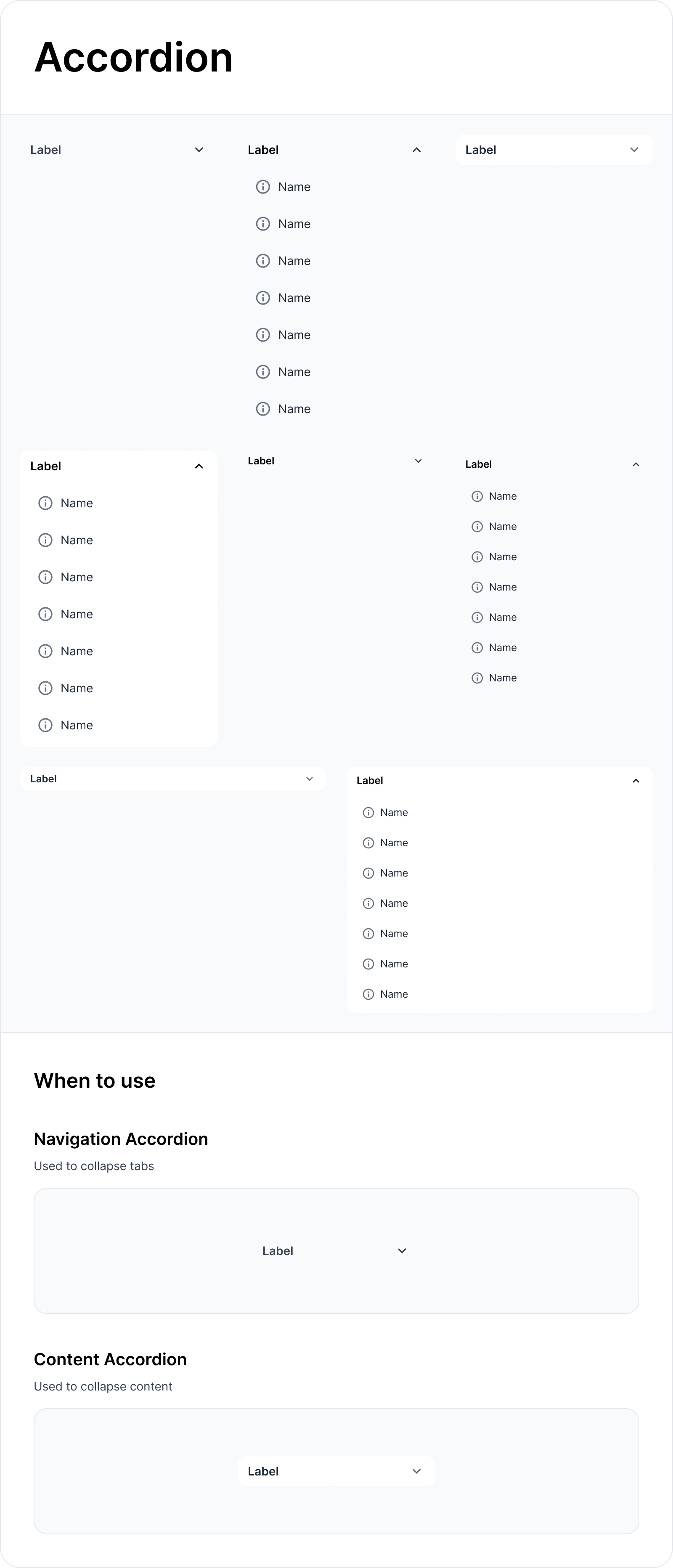
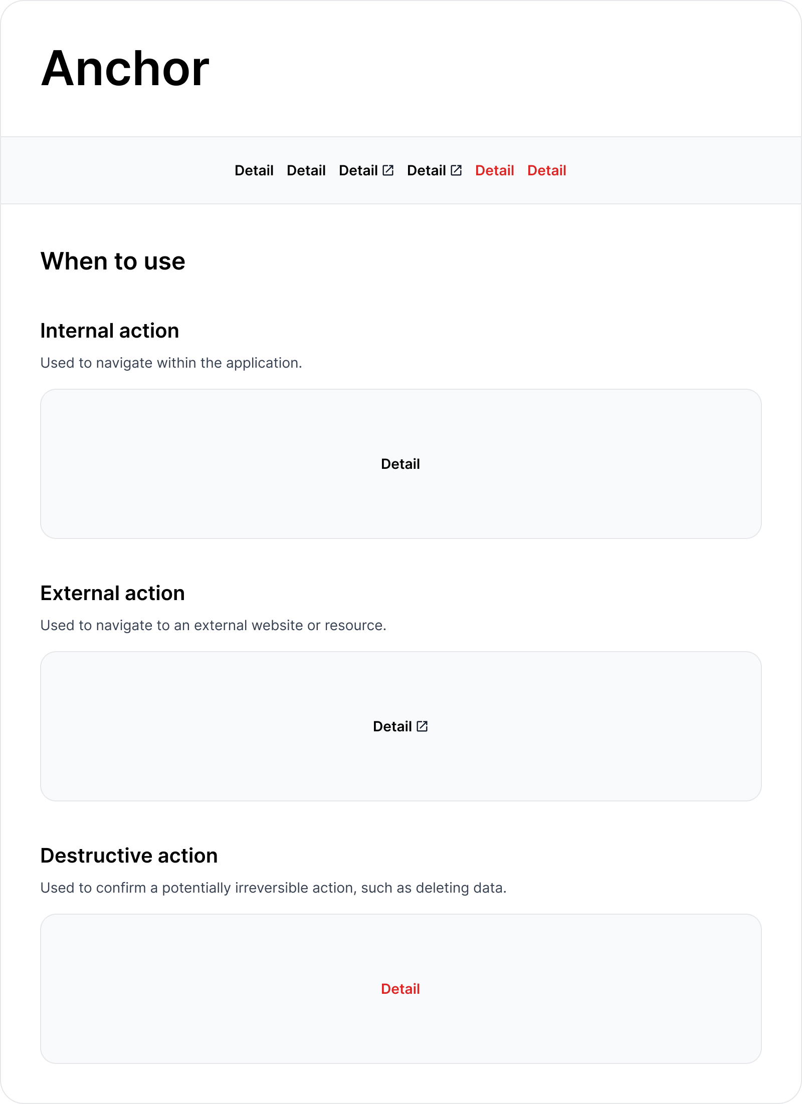
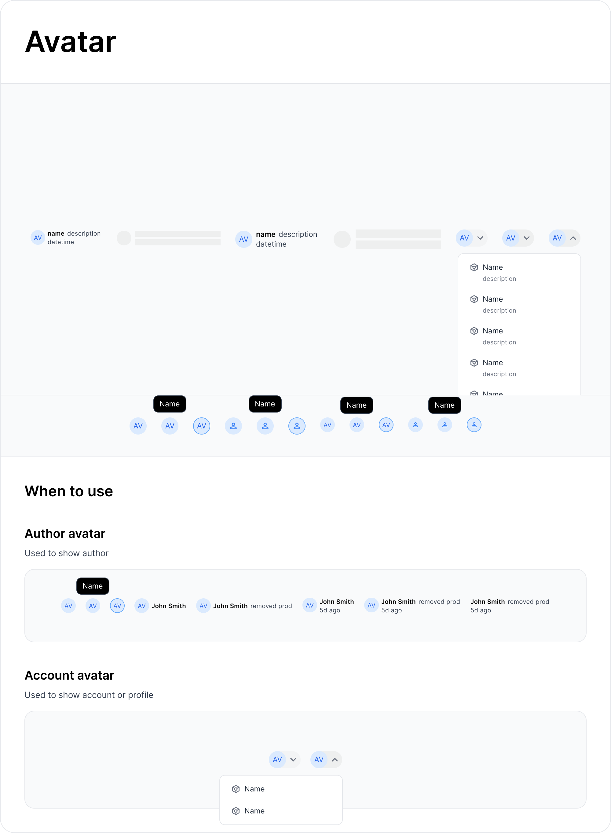
Component Design Process
- Audit existing patterns: Cataloged all current implementations across 3 products
- Define API contracts: Worked with engineering to establish prop interfaces before visual design
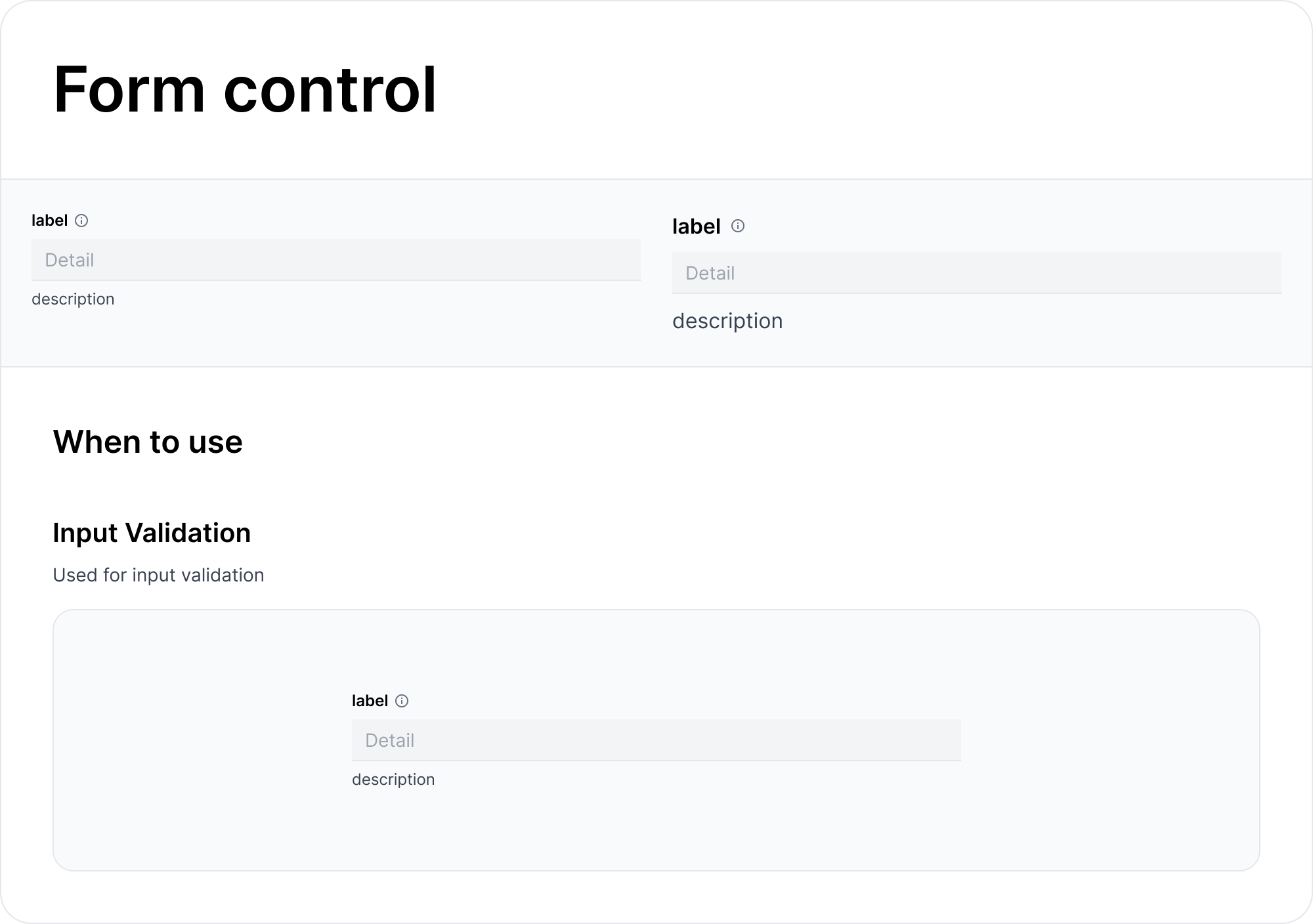
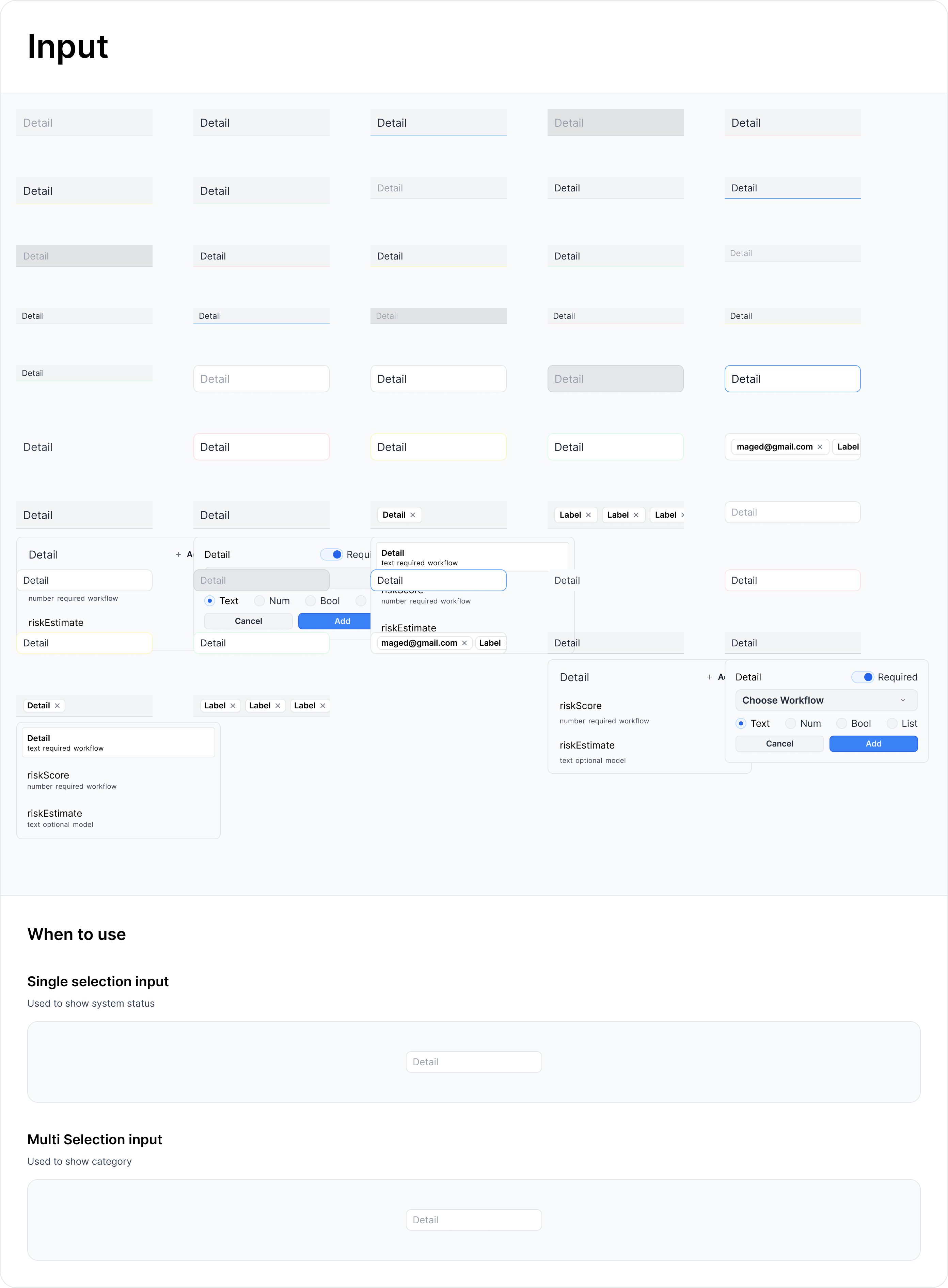
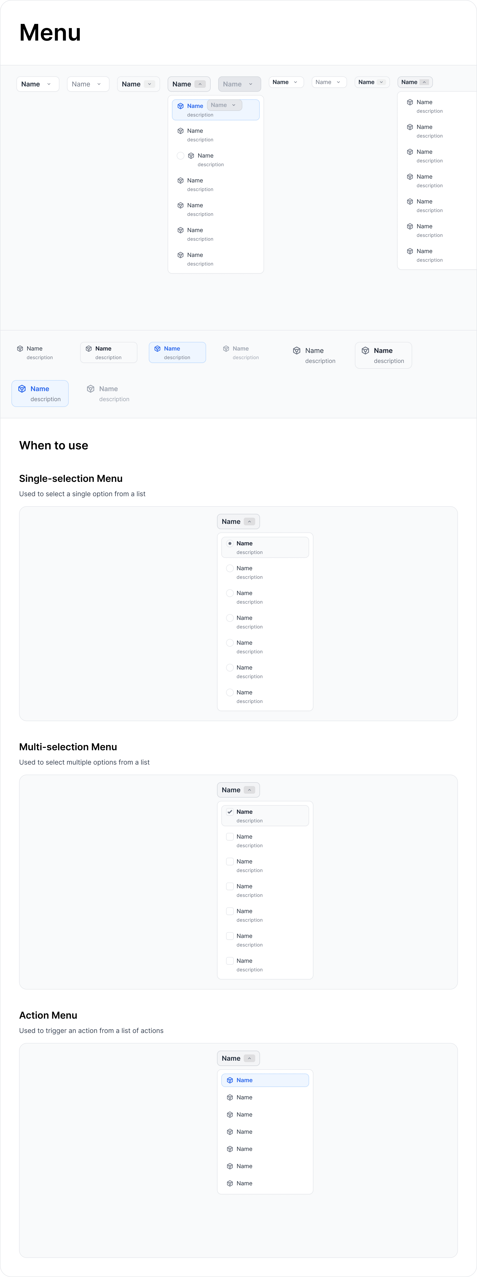
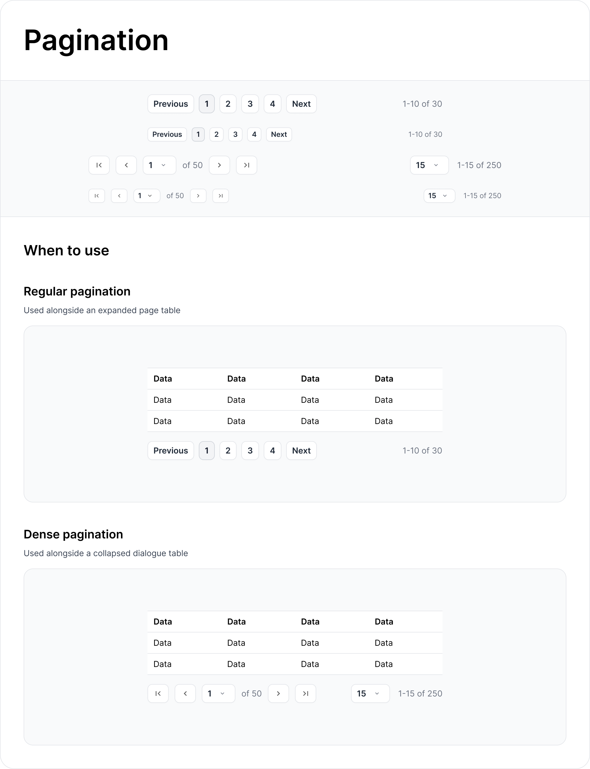
- Design variants systematically: Created size scales, state variations, and theme adaptations for each component
- Document usage guidelines: When to use, when not to use, and how to compose with other components
Visual Design Principles
- Progressive disclosure: Default states are simple, advanced options revealed contextually
- Visual hierarchy: Consistent information density using whitespace and typography weights
- Feedback-driven interactions: Every user action has immediate, clear visual response
- Accessible by default: Color contrast, keyboard navigation, and screen reader support built into every component
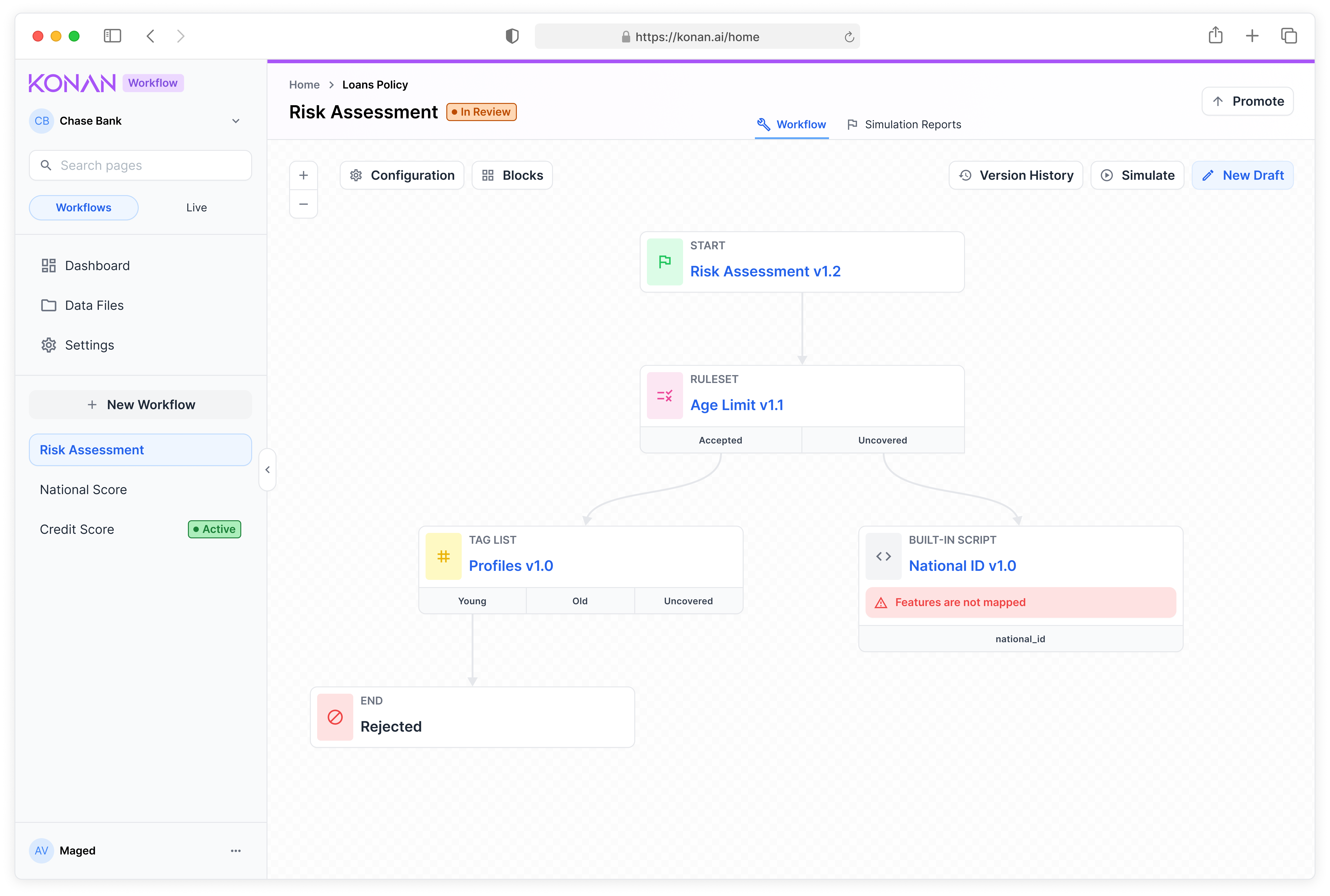
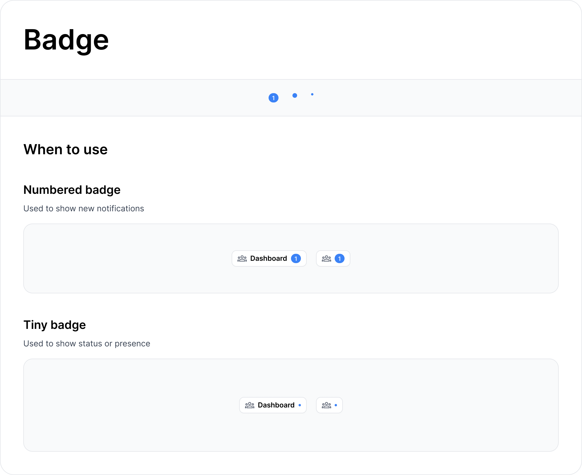
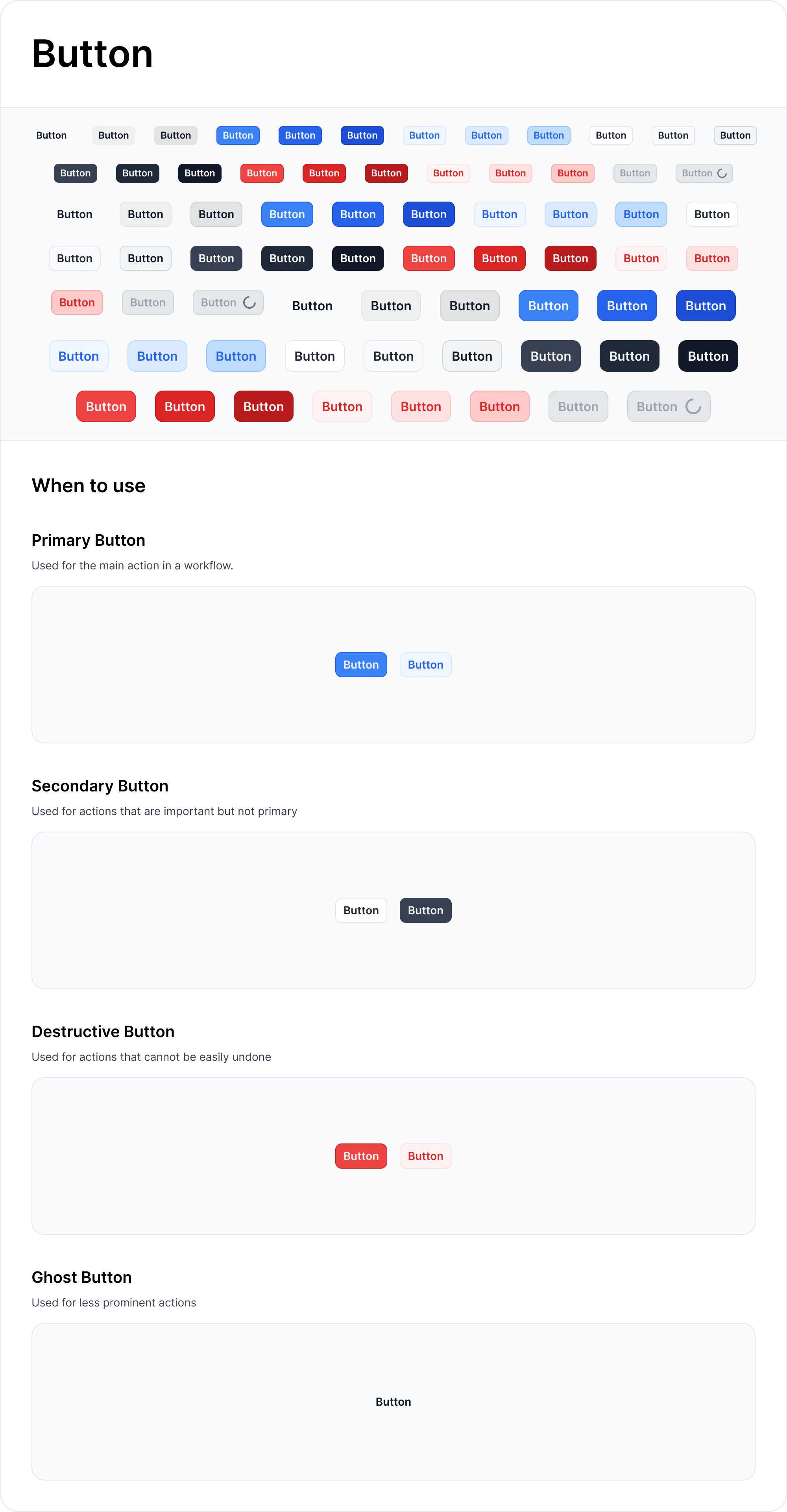
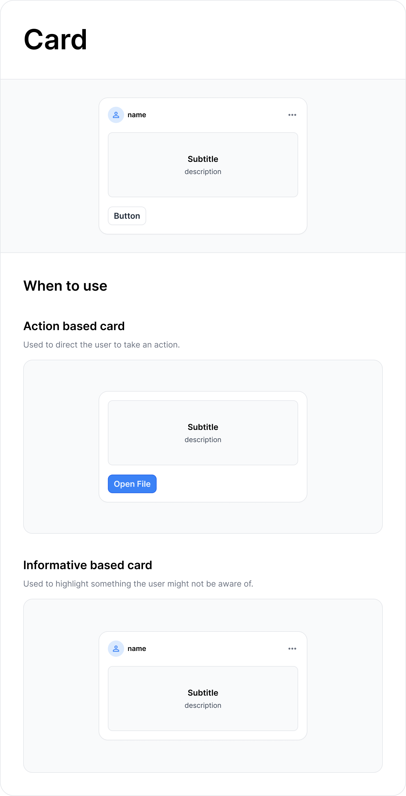
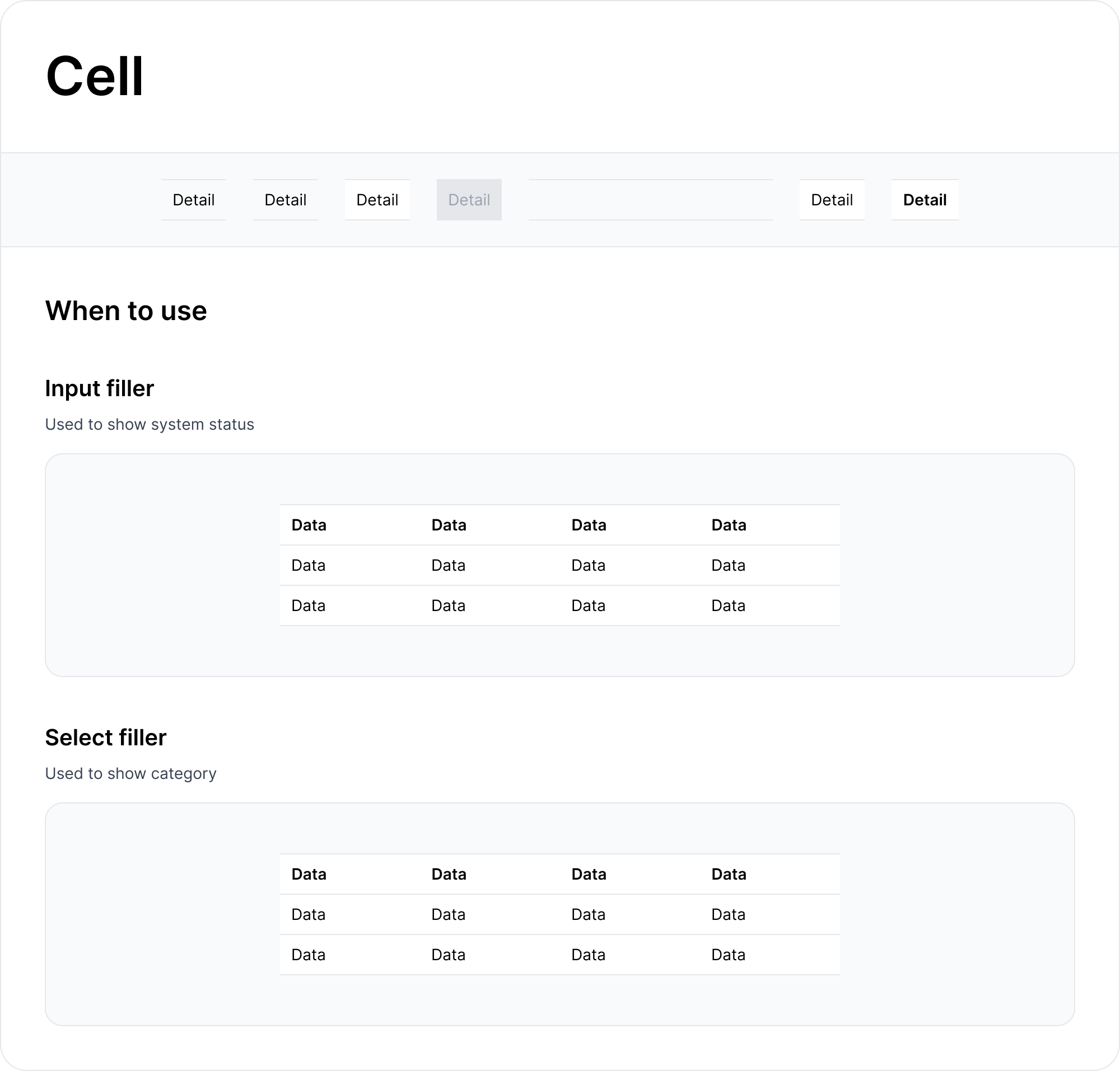
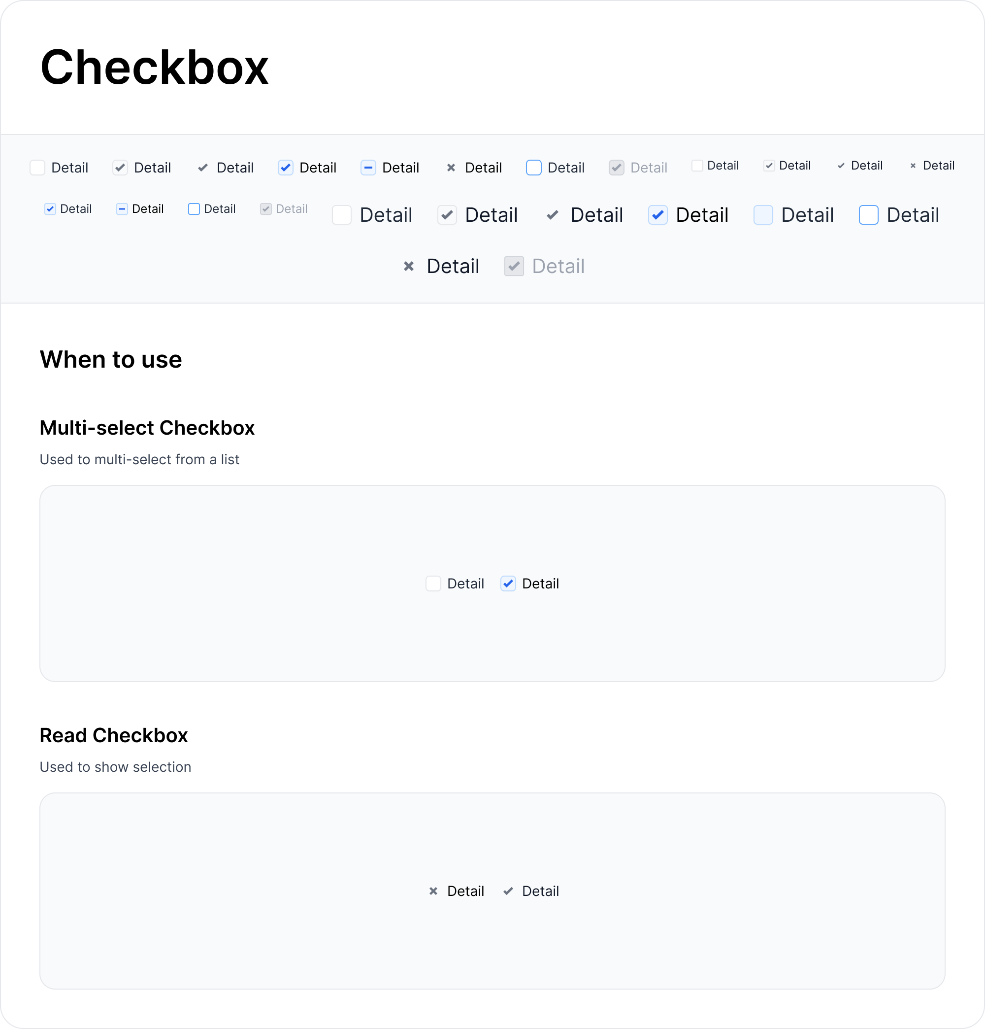
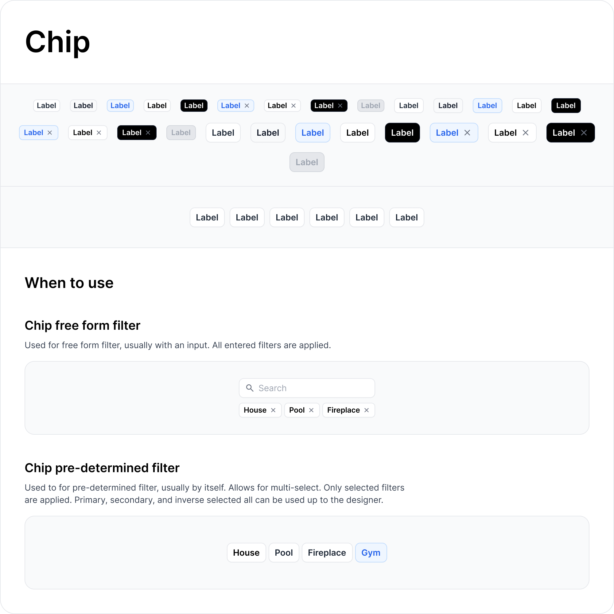
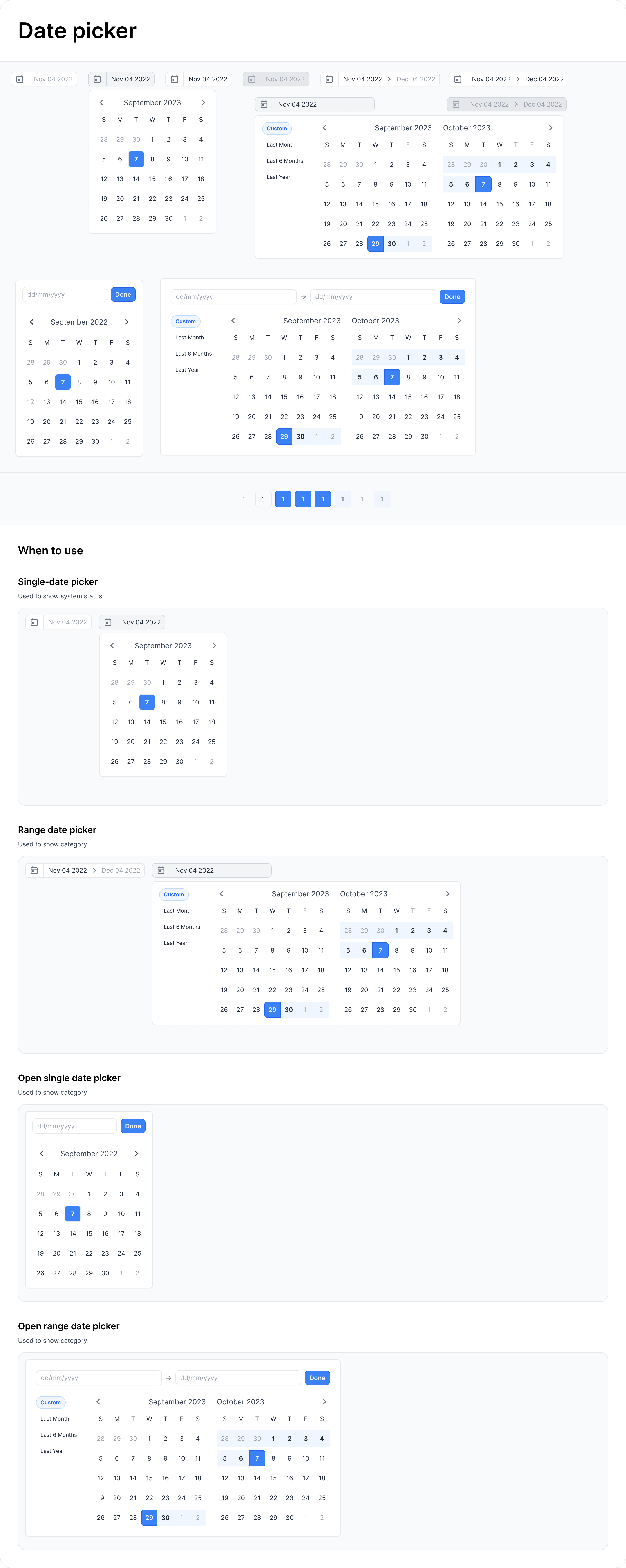
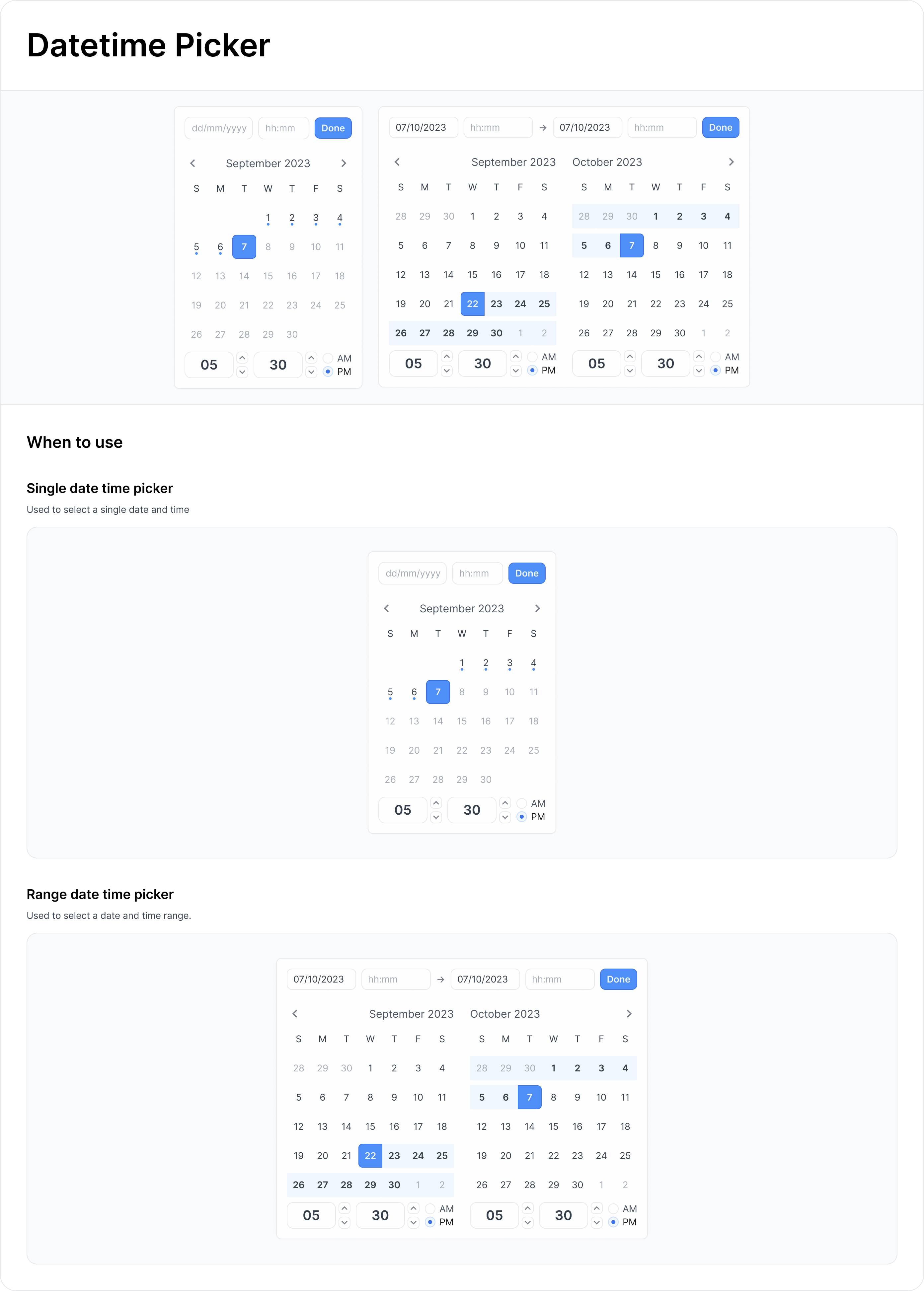
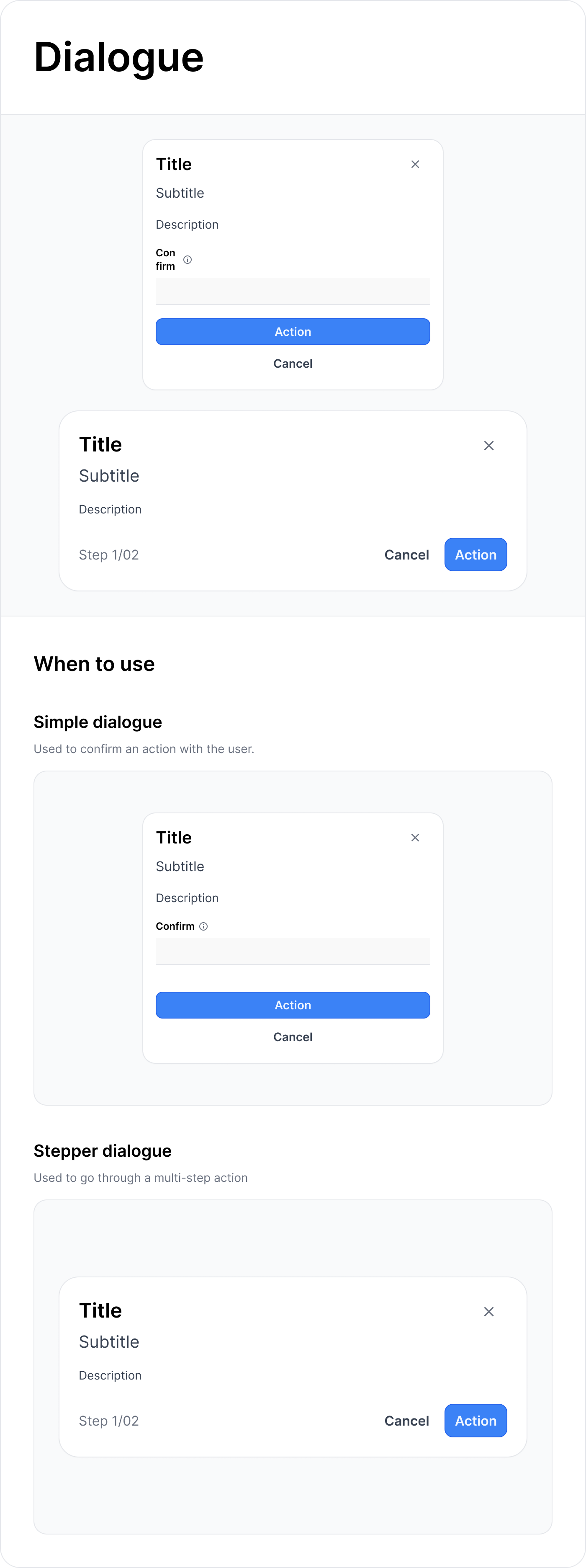
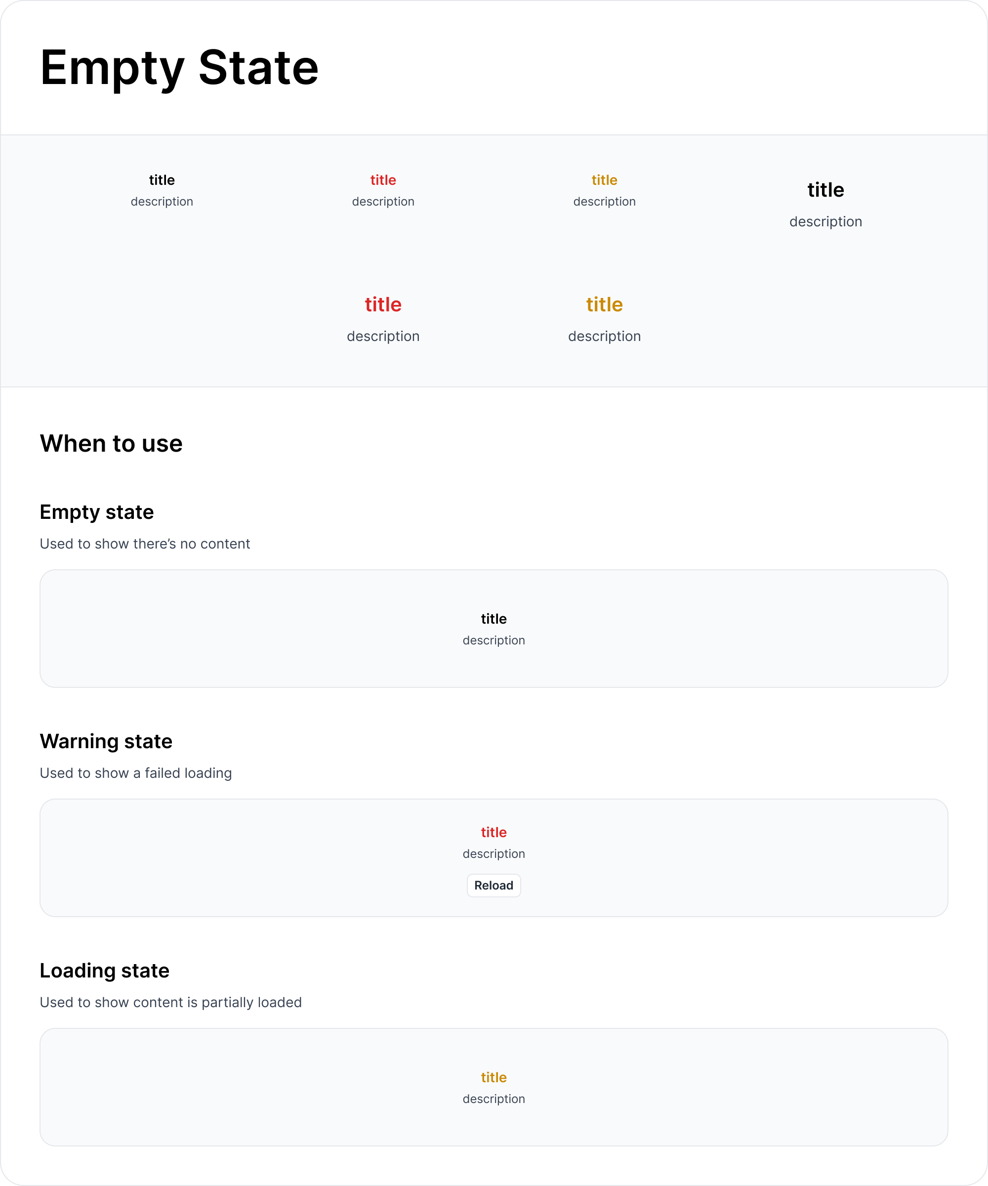
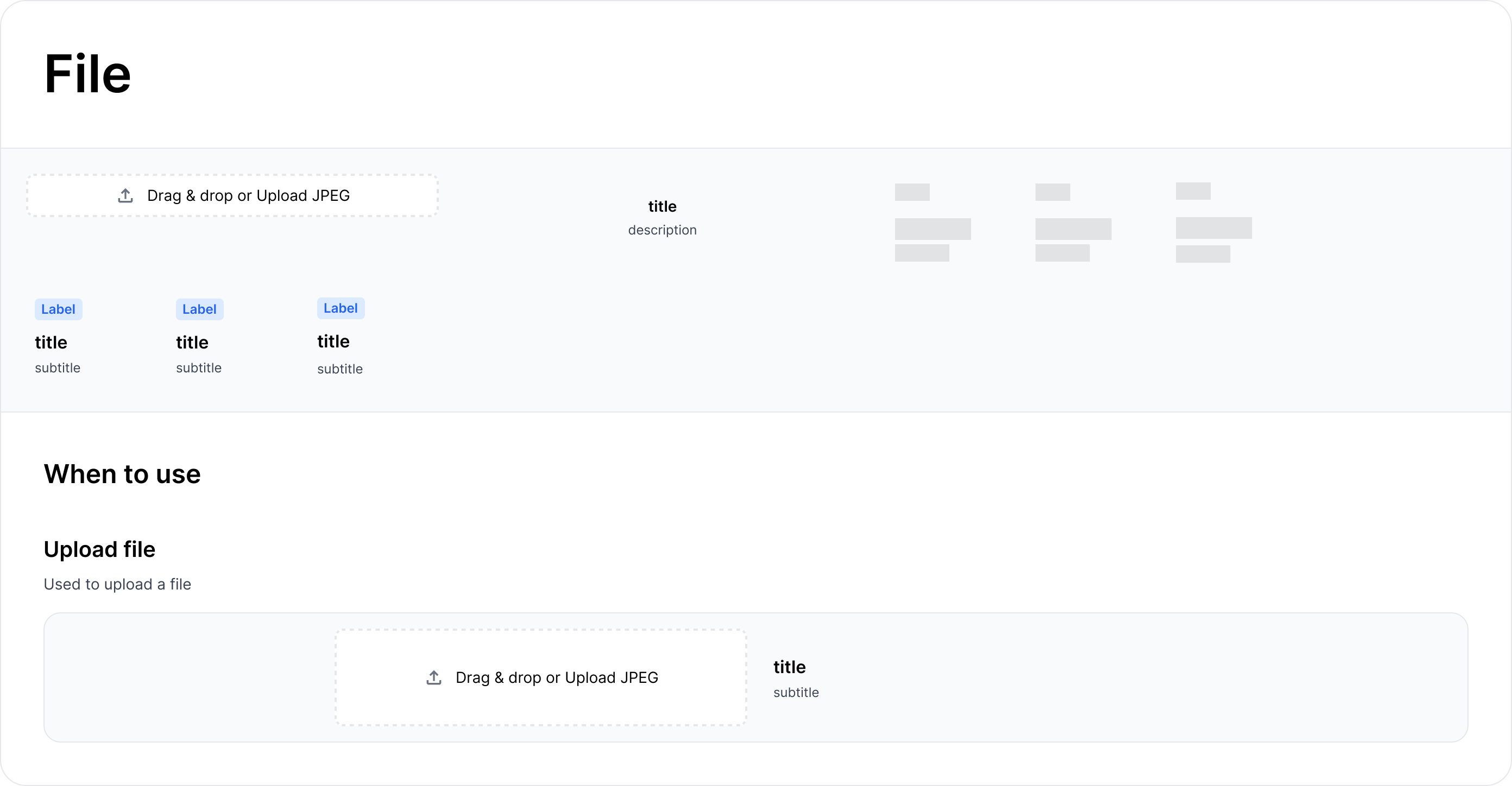
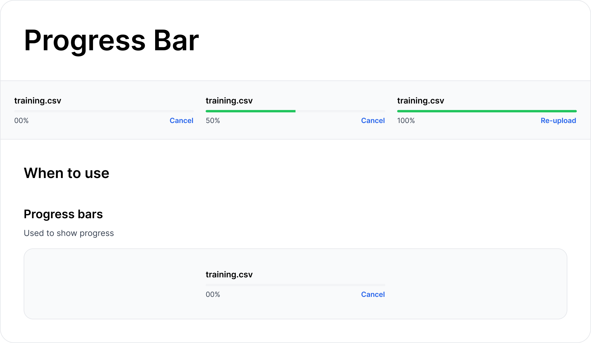
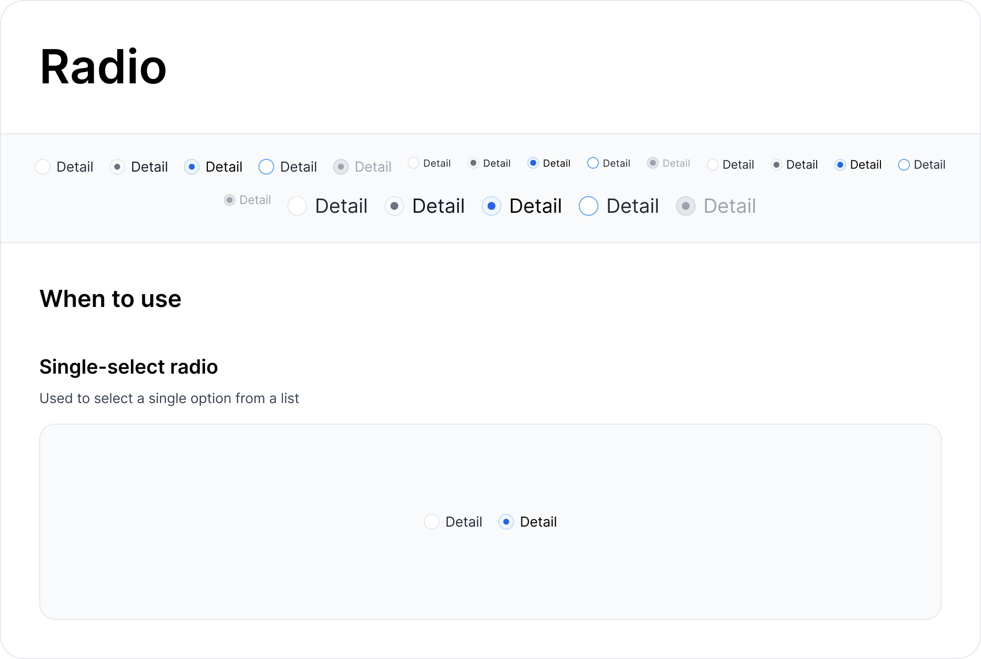
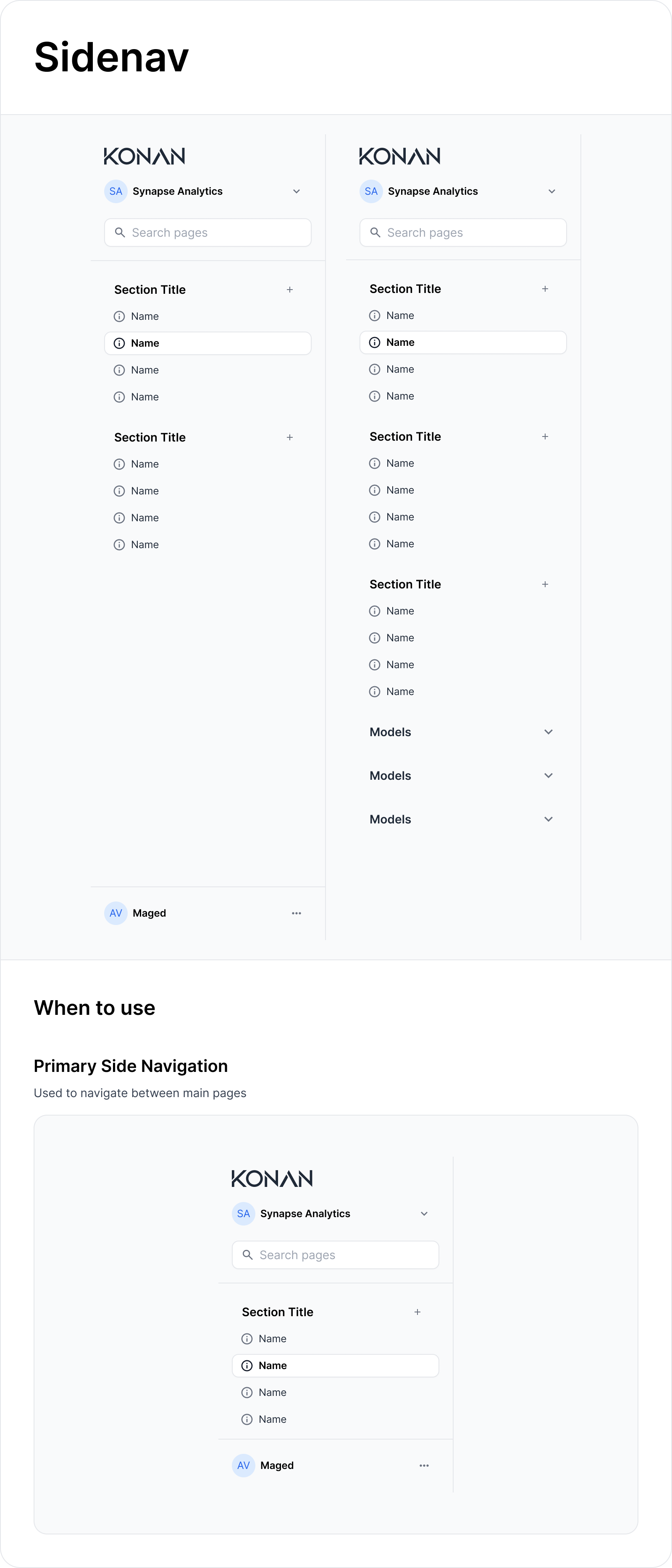
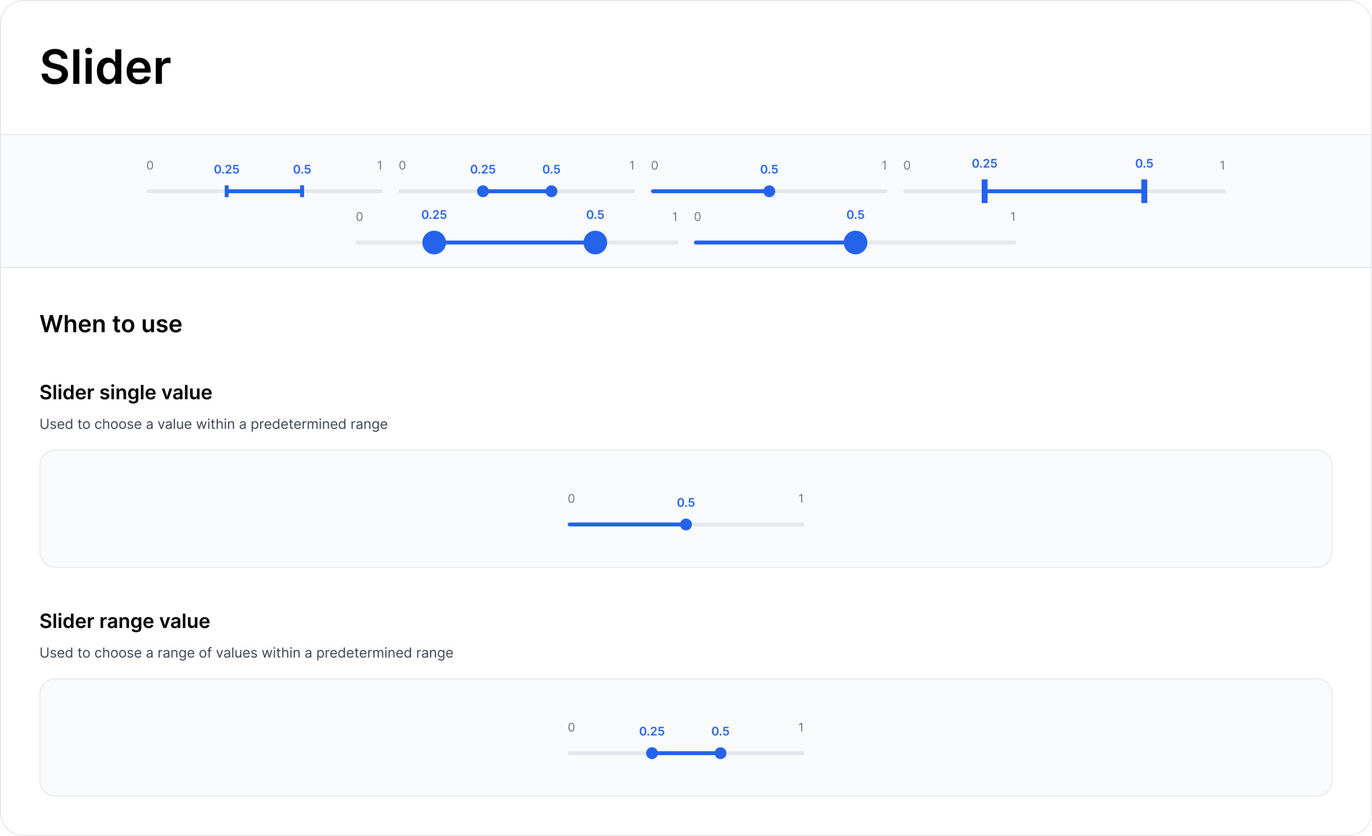
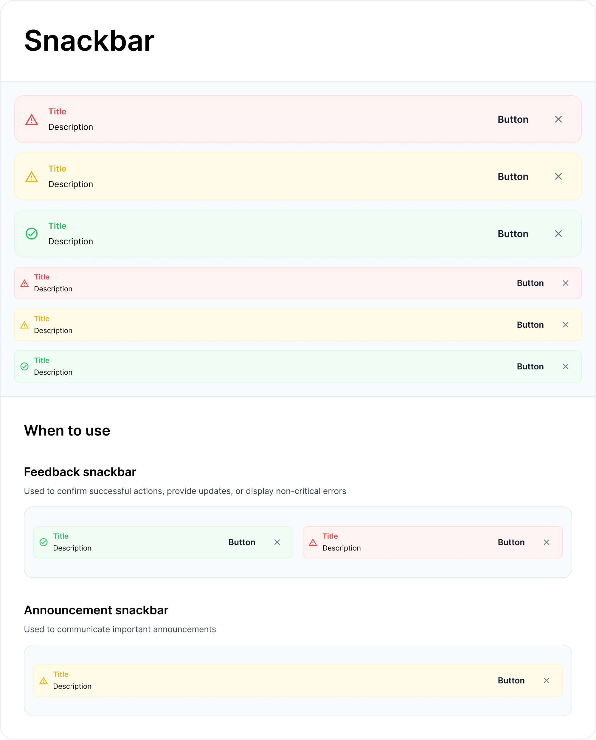
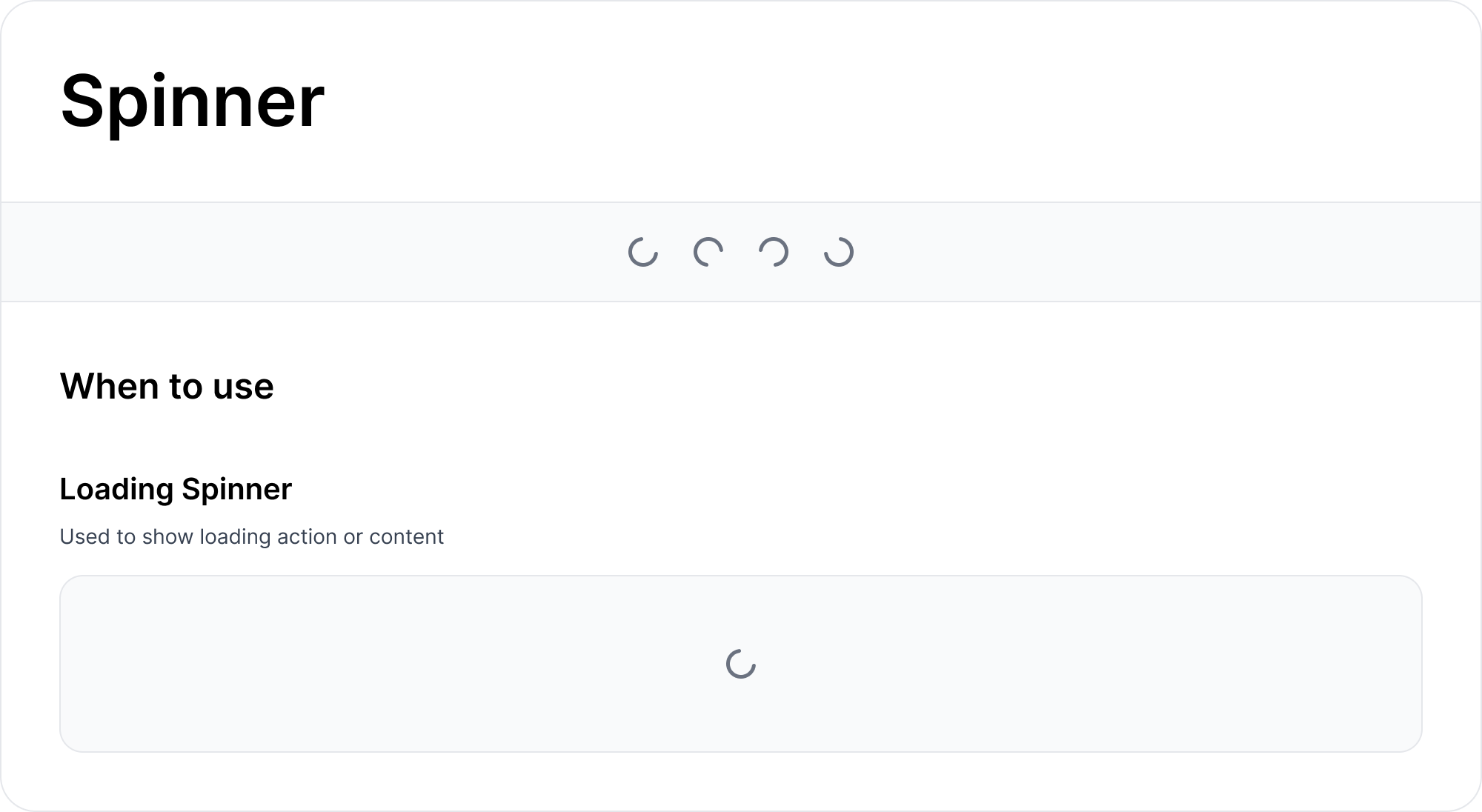
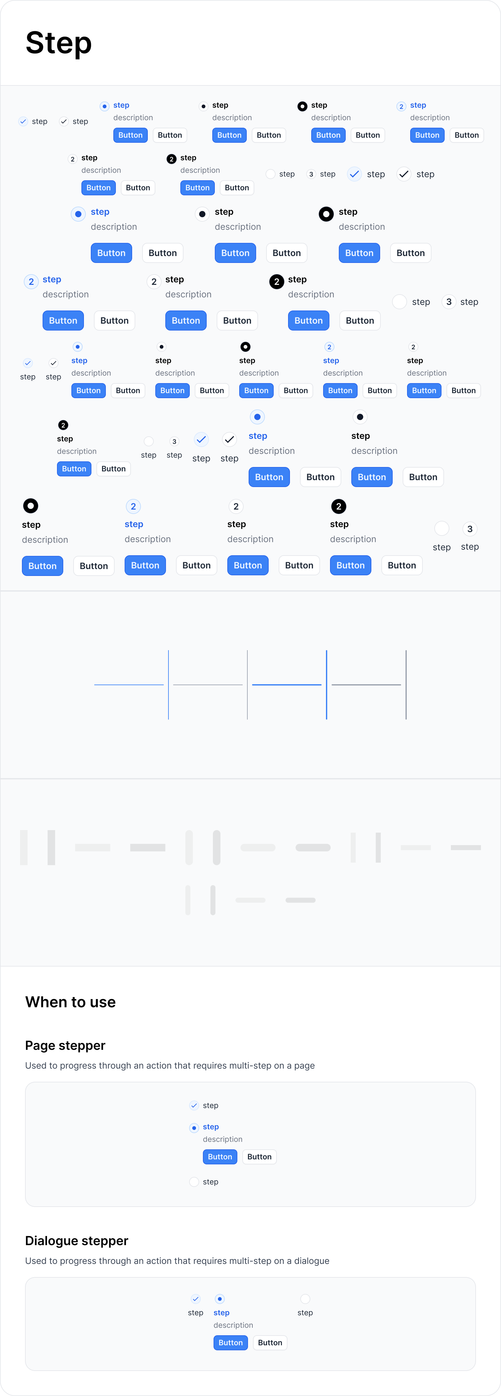
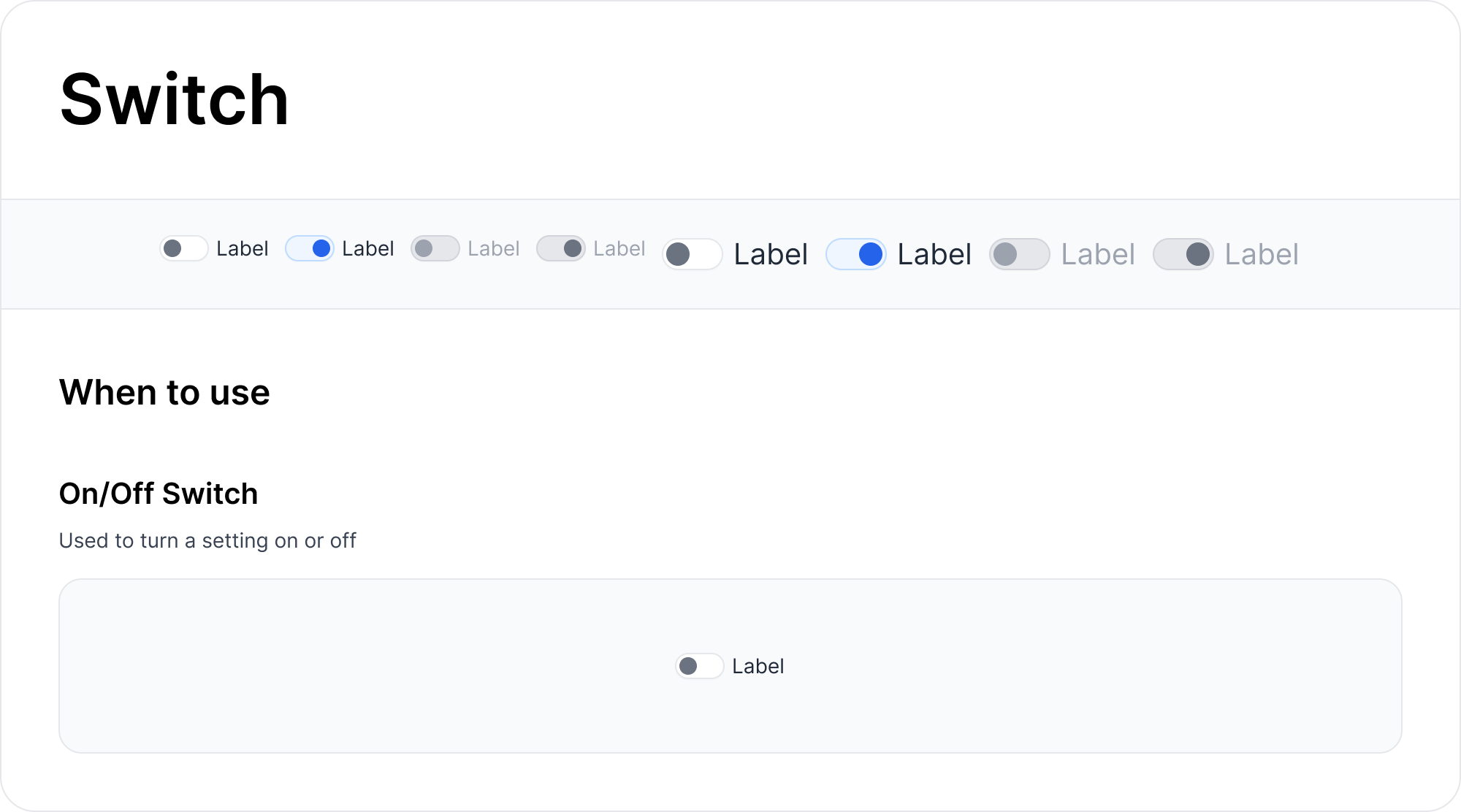
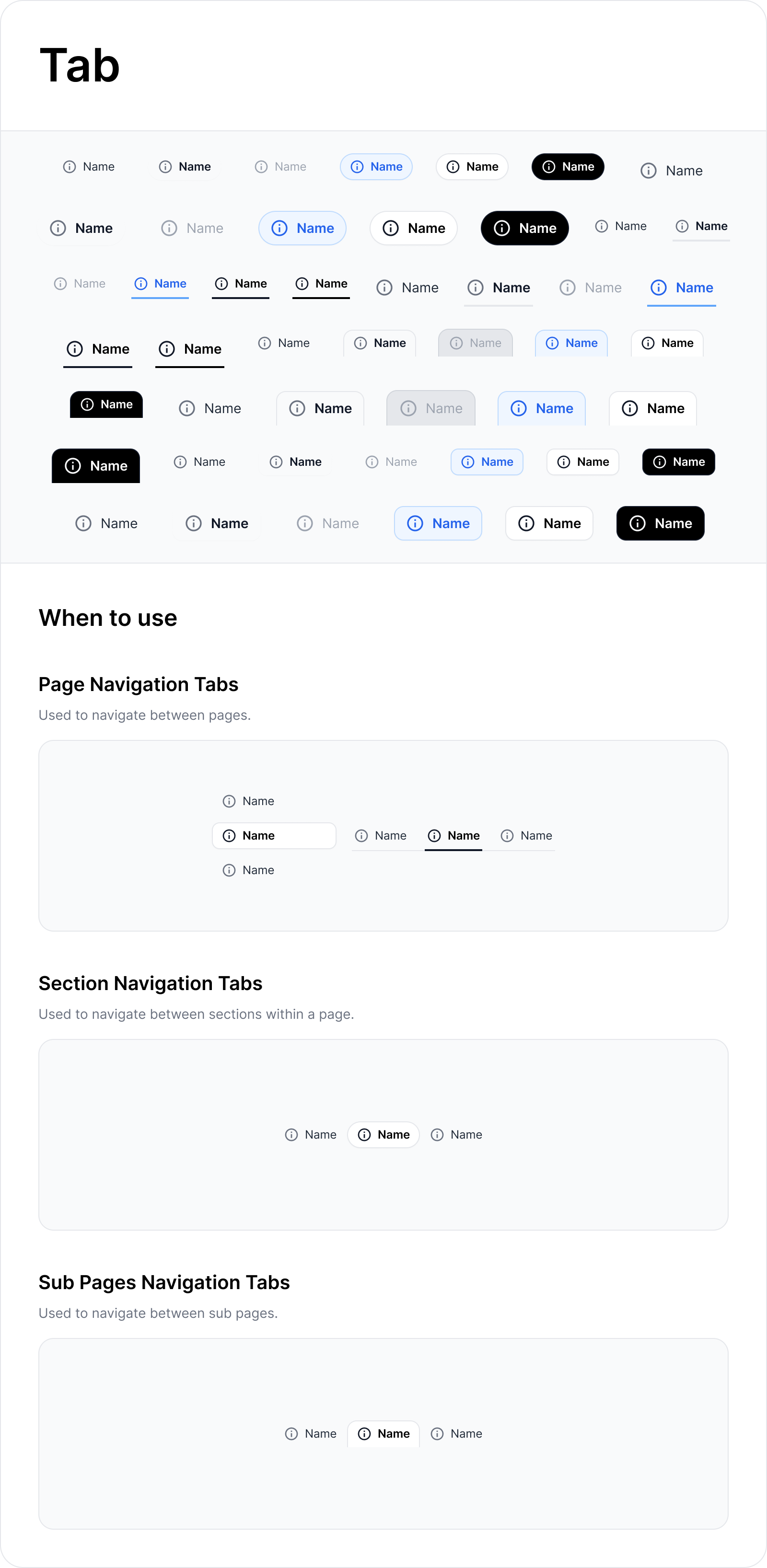
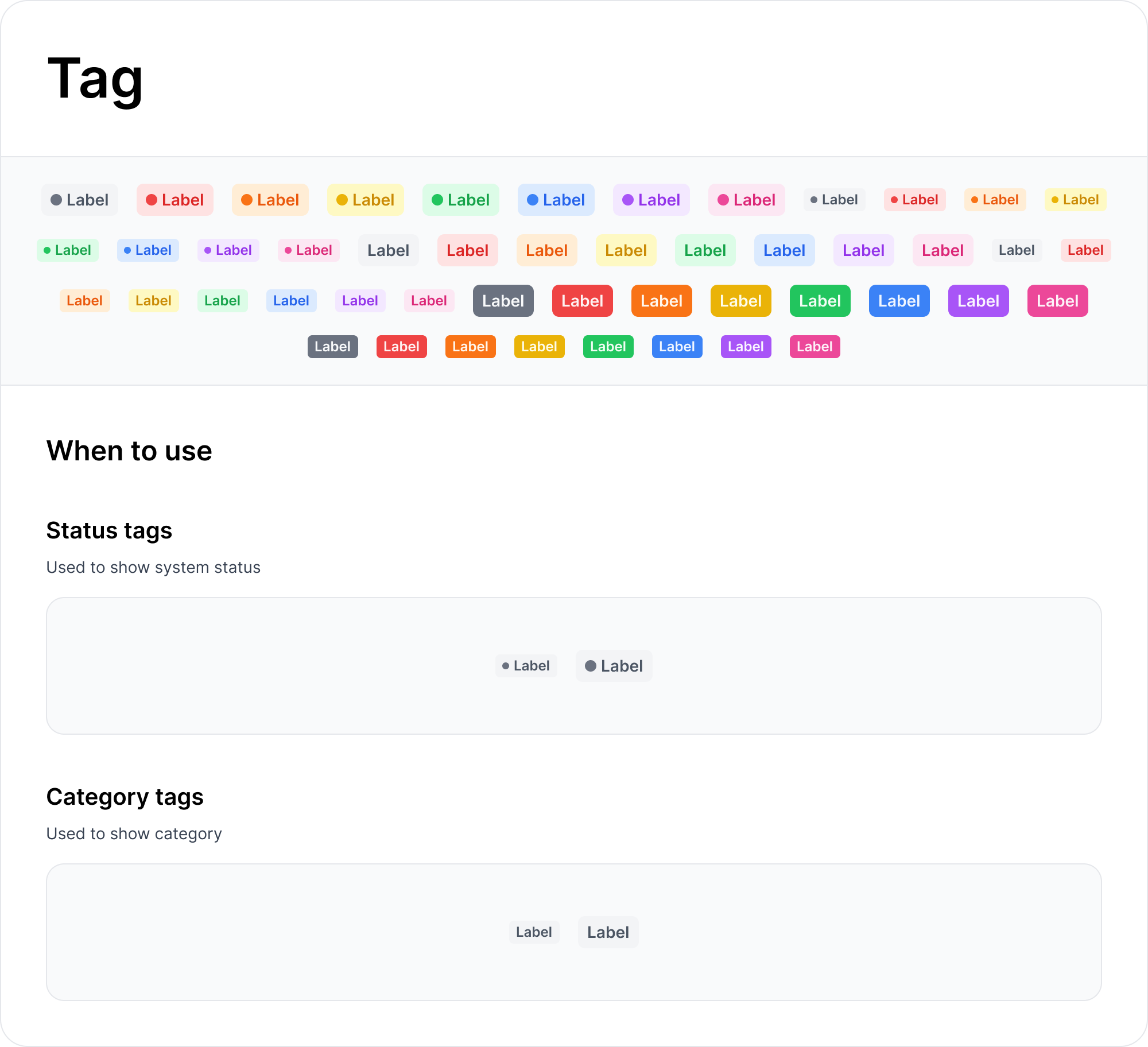
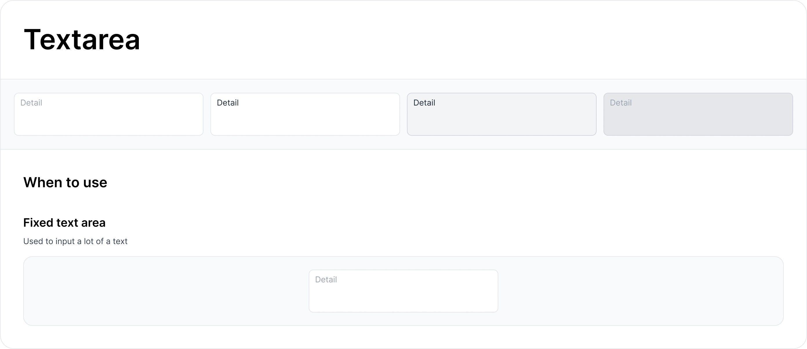
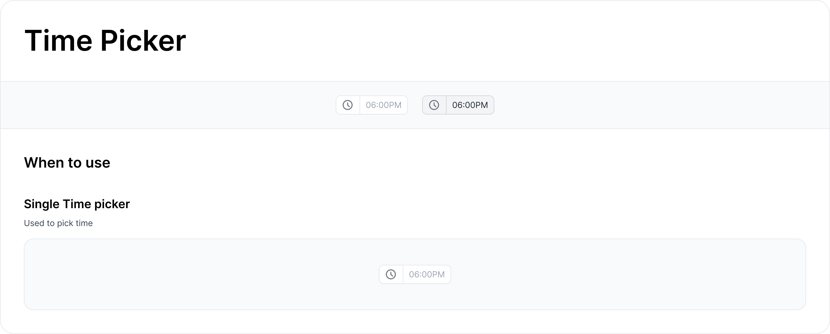
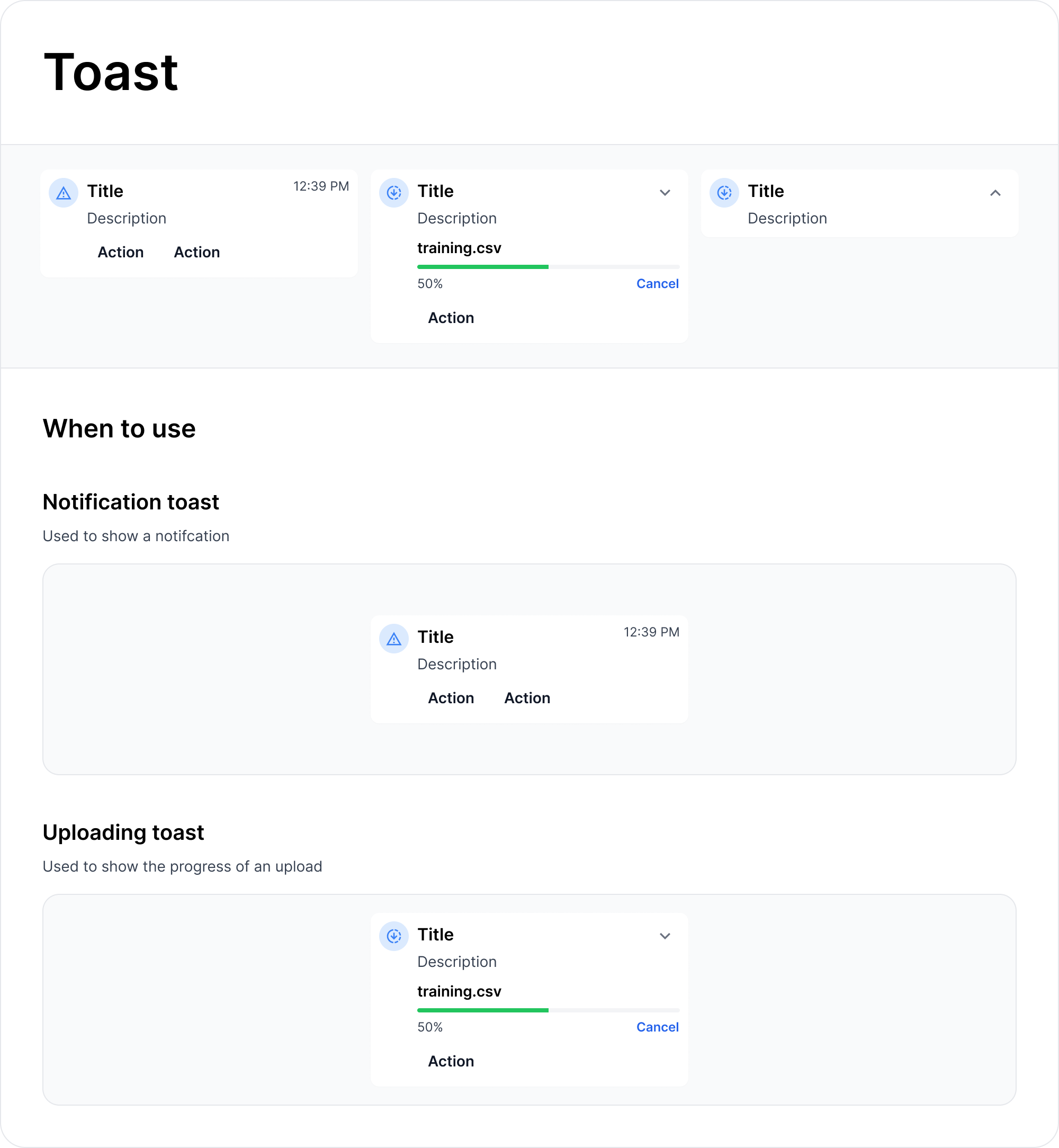
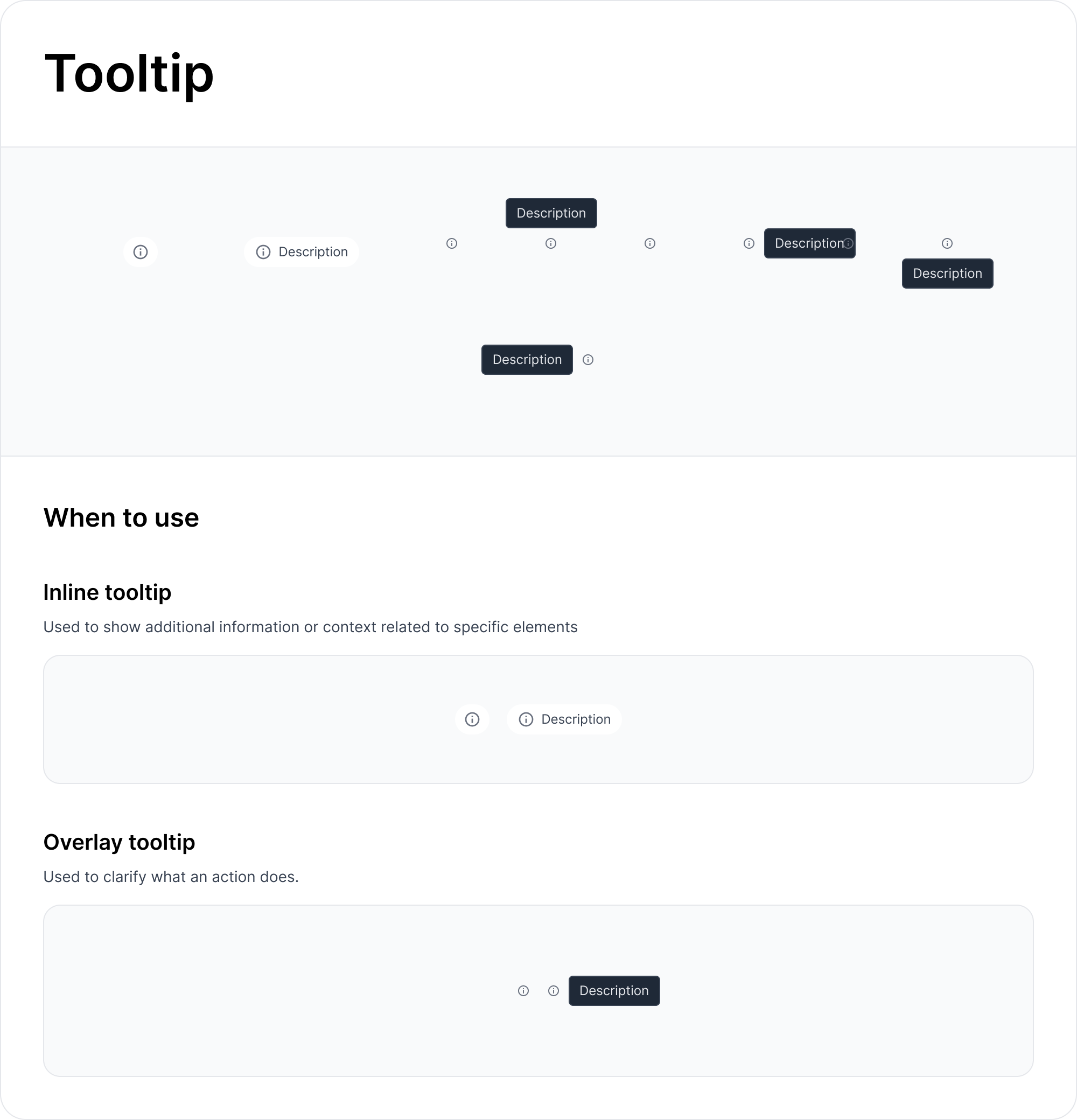
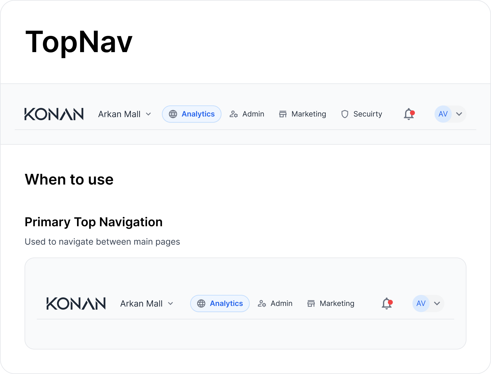
34 Components, Infinite Possibilities
Over 18 months, I designed and built 34 production-ready components with engineering. Each followed three principles:
- Accessibility-first: WCAG compliant from day one
- Composability: Small pieces that build big experiences
- Cross-product compatibility: Works everywhere, every time
Building for Everyone, Testing Everything
Accessibility wasn't an afterthought—it was fundamental to every design decision. Each component was built to work for users regardless of their abilities or assistive technologies.
Accessibility Implementation
- WCAG 2.1 AA compliance: All components tested with screen readers, keyboard navigation, and color contrast analyzers
- Focus management: Logical tab order and visible focus indicators for keyboard users
- ARIA patterns: Proper semantic markup and ARIA labels for complex interactive components
- Responsive design: Components adapt gracefully across viewport sizes and zoom levels up to 200%
Quality Assurance Process
- Cross-browser testing: Automated visual regression testing across Chrome, Firefox, Safari, and Edge
- Performance monitoring: Bundle size tracking and lighthouse score requirements for each component
- Design QA checklist: 15-point review process covering visual consistency, interaction states, and accessibility
- User testing: Regular usability sessions with components in real product contexts
Documentation & Guidelines
- Storybook integration: Interactive documentation with live code examples and accessibility annotations
- Design guidelines: When to use each component, spacing rules, and composition patterns
- Implementation guides: Code examples and common patterns for engineers
- Accessibility notes: Screen reader announcements and keyboard interaction patterns for each component
From Chaos to Competitive Advantage
This changed everything about how we build products
The transformation was immediate and measurable:
Development velocity:
- 60% faster feature development
- Zero time spent recreating components
- Engineers focused on business logic, not UI
User experience:
- 100% consistency across all three products
- Reduced learning curve for multi-product customers
- Professional UIs shipped in weeks, not months
Business impact:
- Competitive advantage in rapid prototyping
- Technical debt eliminated across the platform
- Scalable foundation for future products
What I learned: Sometimes the biggest design impact comes from building infrastructure, not interfaces.